Build a brand identity system
Give words, visuals and touchpoints one consistent set of rules.
Many brands have a logo but no system. Every new piece starts from scratch on colour, type and layout, and with a new designer or agency the brand looks different again.
An identity system is less about looking good than about consistency and efficiency: different people, on different channels, can make things that are clearly the same brand, without debating it every time.
You may be seeing this
- Every deck and flyer looks a little different.
- Agencies and new colleagues keep asking which brand colour or typeface to use.
- Reviews go back and forth because the standard is hard to explain.
- The brand has grown, and the old identity no longer carries new products and channels.
How we approach it
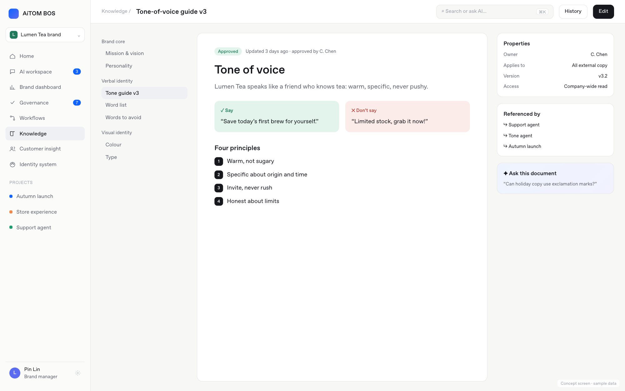
- Start from positioning: confirm the personality the brand should convey, so visuals and voice have a basis.
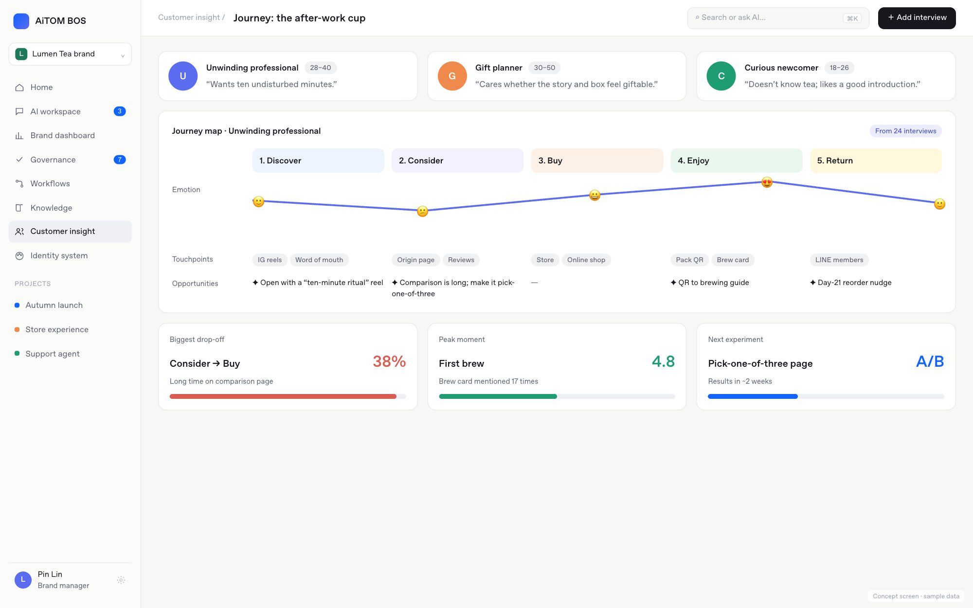
- Map touchpoints: list where customers meet the brand and set priorities.
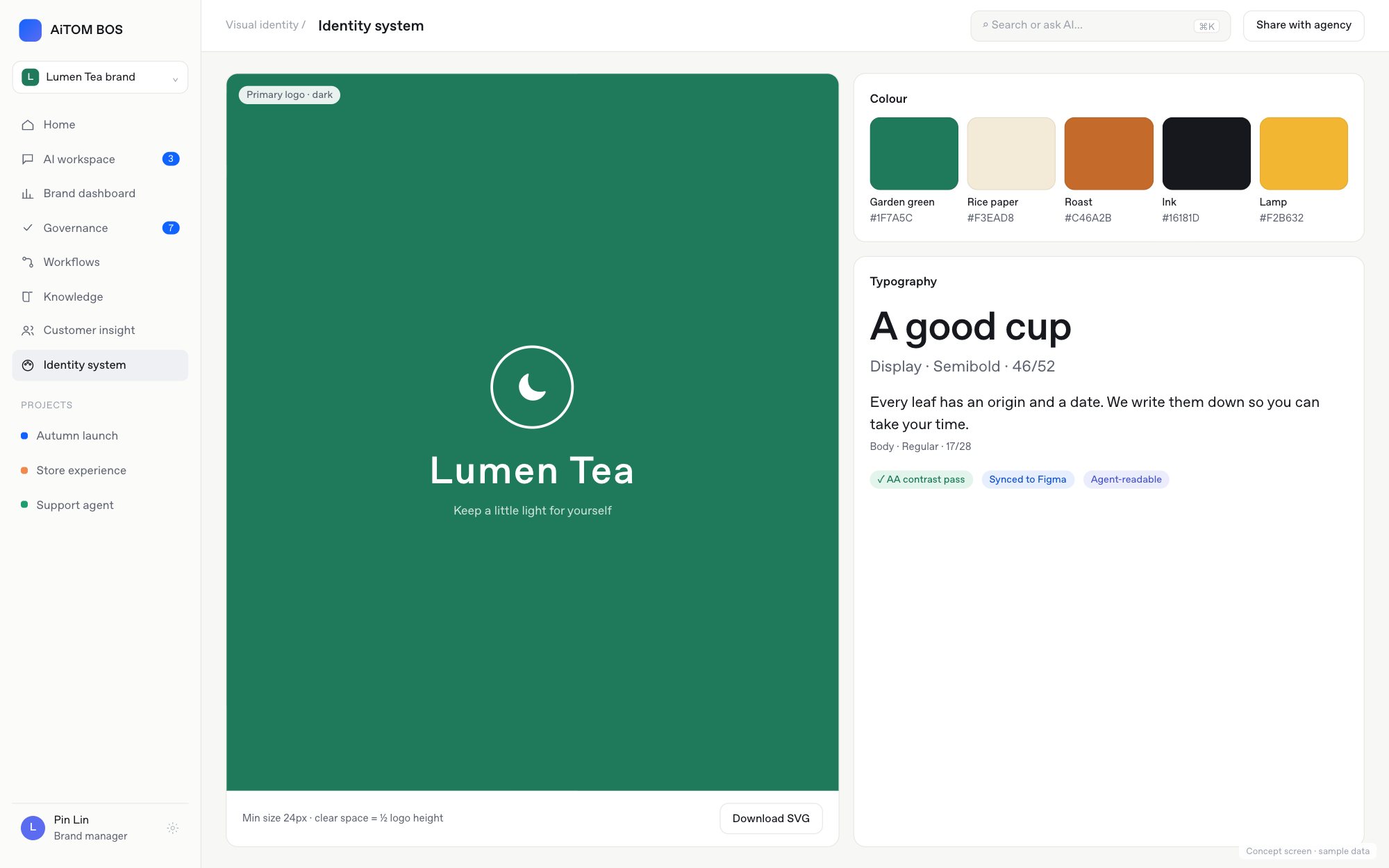
- Define the basics: logo, colour, type, imagery and voice, each with rules for use.
- Build modules: turn common layouts and components into reusable templates.
- Write the guide: show do’s and don’ts with examples, so people without a design background can follow it.
What you get
- Identity elements: logo, colour, type, imagery and icon style.
- Voice guidelines and common vocabulary.
- Templates for key touchpoints: decks, social, documents and more.
- A brand guide with do’s and don’ts.
- An asset kit for agencies and new colleagues.
How to tell it works
Watch how materials are made and reviewed: are new pieces finished faster, are fewer sent back, and does work from different people look like one brand at a glance?
A good identity system lets everyone make things that look like the brand.